Why Rounded Corners in Tableau Matter More Than You Think
What human perception, dashboard design, and community feedback can teach us

If you’ve ever opened Figma just to draw rounded rectangles for a Tableau dashboard, you’re not alone.
Maybe you exported background images.
Maybe you used floating containers and padding hacks.
Maybe you built something beautiful… and then warned everyone not to resize it.
For years, Tableau authors have been jumping through hoops for one small thing: rounded corners.
Not because it’s trendy.
Because it matters.
The workaround era
Let’s be honest, the community got creative.
We built backgrounds in design tools.
Used annotation boxes as pseudo-containers.
Layered transparent PNGs.
Perfected pixel alignment.
We all learned how to fake it.
And it worked.
But it also came with baggage.
Layouts broke when dashboards resized.
Iteration meant rebuilding assets.
New team members had to learn the workaround before they learned Tableau.
Templates became fragile instead of reusable.
This is design debt.
And like all technical debt, you don’t feel it once. You feel it every time you update, iterate, or hand something off.
Instead of focusing on hierarchy, story, and insight, authors were spending time on mechanics.
Your brain on corners
This is where my psychology background comes in.
Research in visual perception shows that sharp angles require more cognitive processing than curves. Work from the Barrow Neurological Institute demonstrated that sharper corners create stronger visual salience, meaning your brain works harder to interpret them.
Put simply: edges take effort. Curves don’t.
There’s also a fascinating phenomenon called the Bouba–Kiki effect.
When people are shown two shapes, one round and one spiky, and asked which one is called “bouba” and which is “kiki,” the overwhelming majority choose the same pairing: bouba for the round shape, kiki for the spiky one.
 and a rounded geometric shape (right)")
This shows up across cultures, languages, and even in infants.
So what does that have to do with dashboards?
It means shape carries meaning before we process a single data point. Before we read a number. Before we interpret a chart.
Why does that matter?
Our brains naturally associate curves with softness and approachability, and sharp angles with tension or abruptness. This isn’t learned from modern UI trends. It’s baked into perception.
Layer on basic conditioning from childhood (sharp edges mean danger, rounded edges mean safety), and you start to see why this carries over into digital environments too.
When users open a dashboard filled with hard edges and sharp containers, their brains register subtle friction. They won’t consciously think, “this feels stressful.” They’ll just feel more fatigued.
Rounded corners quietly reduce that background tension.
And in analytics, that matters.
Every bit of mental energy not spent processing the interface is energy that can go toward understanding the data.
Why rounded corners really matter
This isn’t about making dashboards prettier.
It’s about removing friction.
Rounded corners help:
establish clearer visual hierarchy
reduce fatigue when scanning multiple views
create more approachable KPI cards and containers
align dashboards with modern UI expectations
make templates reusable instead of brittle
speed up dashboard production
simplify iteration
Instead of spending 30 minutes building a Figma background before sharing your weekly performance dashboard, you’ll adjust the corner settings the same way you adjust borders or padding and move on to the actual work.
This feature doesn’t change what Tableau can do.
It changes how easy it is to do it well.
Community demand didn’t appear overnight
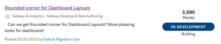
One of the earliest requests for rounded corners on the Salesforce IdeaExchange dates back to 2013, and that original idea alone accumulated 3,580 points.
That’s not noise. That’s signal.
Since then, similar requests resurfaced over the years, gathering thousands of votes in total.
Different users.
Different years.
Same need.
That tells a clear story.
The IdeaExchange isn’t just a suggestion box. It’s how the community signals priorities. Rounded corners sent that signal repeatedly, over more than a decade.
With rounded corners now part of Tableau 2026.1, this wasn’t Tableau adding a nice-to-have.
It was Tableau closing a loop that started over ten years ago.
The community asked. Tableau listened.
Why “simple” features take real engineering
From the outside, rounded corners look like a small UI tweak.
But Tableau is a mature, complex ecosystem: Desktop, Server, Cloud, mobile, embedded analytics, exports, accessibility, rendering engines, performance constraints, and backward compatibility.
A single visual change touches a lot.
Engineering has to ensure:
existing dashboards don’t break
performance doesn’t regress
accessibility remains intact
layouts behave across devices
exports still render correctly
This isn’t about excuses. It’s about doing things responsibly.
The gap between “it works in a demo” and “it works for millions of users in every scenario” is where real product engineering lives.
As someone who works with complex data systems and automation pipelines, I appreciate that discipline.
Simple on the surface rarely means simple underneath.
My take
As a Tableau Ambassador and user group leader, I’ve heard this request for years.
As someone who builds operational dashboards and client reporting every day, I know visual polish isn’t vanity. When you’re delivering media performance data, attribution results, or campaign reporting to clients and internal stakeholders, clarity and professionalism matter.
First impressions matter. Trust matters.
But what excites me most is that it makes good design easier for everyone.
Not everyone on a team should have to know Figma. Not everyone should have to master floating container gymnastics. Native rounded corners mean anyone building a Tableau dashboard can create something polished without leaving the tool.
That’s a big deal.
This feature represents something bigger: Tableau responding to how real people actually build dashboards.
And I hope we see more of this kind of work.
There’s a lot of attention right now on big platform shifts, AI features, and enterprise-level capabilities. And those things matter. But it’s the small, practical improvements like this that directly impact the day-to-day experience of people actually building dashboards. The everyday details that make life easier for analysts, designers, and dashboard authors matter just as much.
Rounded corners aren’t about decoration.
They’re about removing friction.
They’re about listening to the community.
They’re about investing in the people who spend hours inside Tableau every week.
With rounded corners now part of Tableau 2026.1, authors no longer have to leave Tableau just to round a corner. I’ll still use Figma for plenty of things, but one more workaround disappears, and that means more focus on the work that actually matters.
And their dashboards will be better for it.
To everyone who voted, shared workarounds, and kept pushing, this one’s yours.
Here’s to smoother corners and sharper insights.
Great insights here! I had never considered that rounded corners would ease mental friction.
I’m really impressed at how Tableau has engineered this “from the ground up” - the feature does way more than just rounded corners. I’m looking forward to seeing all the ways the community will showcase this very popular new addition.